Overview
On This Page

Graphics are the earliest form of media. The earliest form is also the one that we all learned to create as children, and the ability to create graphics still resides with each of us. When combined with principles informed by research, these skills can help in the development of graphics that will support the learning of your students.
Weeks 5 and 6 encompass both drawn graphics and photographs, though many of the activities and principles can apply to both. You will learn about finding graphics and photographs that are licensed for your use, how to create and edit graphics, how to make them accessible for all learners, and how student-created graphics can be a component of effective student activities and assignments.
Learning Outcomes
When you have completed these weeks you should be able to:
- Design and configure graphics for learning.
- Develop and edit graphics for learning.
- Implement accessibility strategies for graphics.
- Discuss graphic production projects for students.
Topic 1: Design and Develop Graphics for Learning
After text, graphics will be the most frequent media you use to promote learning. Graphics work along the visual pathway described by Mayer in “Multimedia Instruction” (2014, p. 388), which you read in Week 2. It can be combined with text or audio to generate multimedia learning.
Using online images, either as we find them or modified for more effective learning, is the quickest way to develop the materials you need to support student learning. Finding materials that you may legally use is more difficult than just finding an image on the internet.
While a Fair Dealing exception may be applied to an image used in a limited way (i.e., not distributed widely), it is best practice for online learning to only use images where sharing is allowed. There has been a general tolerance for the use of images within a “mashup” creating a derivative of the original, there have not been any court cases setting the boundaries of this use under the new Canadian copyright law.
Creating your own images, from scratch or with some base materials, is a skill educators should seek to develop. In most applications, educational graphics should be simple in their form. Even the simplest examples created by educators can have value. In this topic, you will have several opportunities to modify and create educational graphics. The goals are for you to establish your technical ability to complete these tasks, and to see how you can improve your ability with further practice. Whether or not your work is an aesthetic masterpiece does not affect its ability to support learning.
Activity 1: Readings and Video
Read the chapter “Integrated Model of Text and Picture Comprehension” by Wolfgang Schnotz.
Schnotz, W. (2022). Integrated Model of Text and Picture Comprehension. In R.E. Mayer & L. Fiorella (Eds.), The Cambridge Handbook of Multimedia Learning (pp. 82-99). Cambridge University Press.
Now read the chapter “Three Views of Instructional Visuals” by Clark and Lyons (2010, pp. 15–28), and then watch the YouTube video What Is Visual Rhetoric? (Lee, 2016).
Now read this Edutopia blog post by Vogelsinger (2014) “Inventing Infographics: Visual Literacy Meets Written Content” and Dunlap and Lowenthal’s (2016) article “Getting Graphic About Infographics: Design Lessons Learned from Popular Infographics” in Journal of Visual Literacy.
Activity 2: Source Graphics for Educational Use
The ability to find and use existing graphics will save you a lot of time regardless of if you use them as you found them or modify them to better suit your lesson. Graphics that are published with permissions to copy and modify can be found in many places. Explore the following resources to get a better sense of the materials available.
For this activity, determine one learning outcome that you have used in the past or that you could use in the future to teach in an online or blended environment. Search for a graphic that will support your learning outcome as is or with modification. Be sure that the graphic is licensed for open copying and modification.
Write a short portfolio post that lists your learning outcome and displays your graphic. Explain how the graphic supports your learning outcome as is or with modification, and link back to readings to support this use. Also indicate the URL where your graphic was obtained and the license under which it was copied.
Activity 3: Crop a Photo
In this activity, you will use software to trim a photo so that only a specific portion is retained. This is an important skill because leaving elements in an image that don’t support learning is counter to Mayer’s (2014) coherence principle. Cropping can also be useful to conserve space and allow the image to integrate more effectively with text on a web page.
You can use any software you wish for this activity, but specific instructions will be provided for the open-source, free application Gimp, or a web-based application like SumoPaint or Photopea.
Once you have cropped the photo, display it in a portfolio post with a short explanation of the reason for focusing on the element of the photo you cropped (refer to readings and theory as appropriate), the software tool you used, and how you found the process or workflow (i.e., will this method be usable for you in the future?).
You can complete this activity using one of the images below or you can use one of your own. If you use your own, please display both the original and the cropped version in your portfolio post.
Activity 4: Resize an Image
As you have seen this week, almost all graphics (drawings and photographs) on the web are displayed in a system that uses a number of pixels. The size of an image is measured in pixels, and usually it is displayed using this “native” resolution.
In this activity you will use software to change the resolution of an image. This can be important to make the file size of an image smaller so that it downloads faster, to make it fit on a web page better, or to create a thumbnail that will link to the full-size image.
Use one of the images below or one of your own to complete this activity. You can use any software you would like to create your thumbnail, including Gimp and SumoPaint. Add this image as an update to the portfolio post you created for Activity 3.
The Quebec Conference Canada, August 1943
Advanced Version: Crop and Resize an Image
Sometimes a thumbnail of a complex image isn’t recognizable at the smaller scale so it doesn’t have much use in prompting people to click the thumbnail to see the larger version. In this case, it’s often better to select one key (and perhaps recognizable) portion of the larger image, crop it, resize it if necessary, and make a thumbnail of just that portion of the image.
You can create a cropped thumbnail of one key portion instead of the entire image, as described above, if you wish.
Activity 5: Create a Graphic
Note: the media you produce for this activity could become an element within your ‘Assignment 3: ePortfolio of situated educational media’. This activity could serve as a dry run for another piece of media, or you could incorporate feedback and your own reflection to submit an improved version.
One important skill to maintain as an educator is the ability to create graphics from scratch. There are many online and downloadable applications that will let you create graphics on your computer. These range from simple programs like MS Paint or PowerPoint to more complex tools like SumoPaint, Photopea or Inkscape. These tools let you create a graphic using lines and shapes.
Using a learning outcome from a previous activity, or a new one, design and create a new graphic using a tool of your choice. Edit your portfolio post for Activity 3 to include the learning outcome and your graphic, along with the tool you used. Also refer to the theory and readings that support your design, and include a description of the production process you used.
Advanced Version: Create a Graphic Using Layers
Using Inkscape, Photopea, SumoPaint, or another tool like Adobe Illustrator, create a graphic that utilizes layers to make multiple versions of the graphic available. This could be a diagram with a version that provides labels and a version that presents space for students to add labels themselves. It could be a map of Canada with two versions to indicate cities, provinces, or major highways.
Make a portfolio post as described in the original activity, but include multiple versions of your graphic.
Your Open Learning Faculty Member will provide feedback on your graphic.
Activity 6: Situate an Educational Graphic Within Online Learning
Note: the media you produce for this activity could become an element within your ‘Assignment 3: ePortfolio of situated educational media’. This activity could serve as a dry run for another piece of media, or you could incorporate feedback and your own reflection to submit an improved version.
Activity 6 is presented with a standard and an advanced version below. Complete either one, or try both.
Educational graphics do not exist outside of a larger context within your online lesson. They are dependent on the context students find them in. So, just as important as a well-designed graphic is a well-designed page that makes effective use of that graphic.
Take one graphic that you have sourced, modified, or created, and place it in a portfolio post along with text, a caption, and a title that will make this an effective learning experience for your intended students. In a comment to your post, list the learning outcome you are supporting, describe your intended students, and reference theory and readings (Schnotz, 2022 and/or Clark & Lyons, 2010) to explain how your design and the context you’ve placed around your graphic is increasing its effectiveness for learning.
Once you have posted your situated graphic, review the posts from at least three other students and offer your thoughts on their creations. Use any of these prompts as appropriate. What is effective? What might be improved? How might you approach it differently? Comment on how their graphics might inform those you produce.
Your Open Learning Faculty Member will provide feedback on your situated graphic.
Advanced Version: Create an Educational Infographic
Re-read the articles by Dunlap and Lowenthal (2016) “Getting Graphic About Infographics” and Vogelsinger (2014) “Inventing Infographics.” For additional tips on how to create effective infographics, see this optional reading by Balliett (2011) “The Do’s and Don’ts of Infographic Design.”
Create a learning outcome from your teaching area that could be supported by an infographic. Develop a design for expressing key information or a concept in an infographic that would support your learning outcome. Work from examples given in the readings and use templates (linked in Dunlap and Lowenthal, or search for “infographic template”), and/or tools such as Easelly or Piktochart to develop your infographic.
Post your completed infographic along with your learning outcome to your portfolio. In your post, reference theory and readings (Schnotz, 2022 and/or Clark & Lyons, 2010) to explain how your design and the context you’ve placed around your graphic is increasing its effectiveness for learning. Once you have posted your infographic, review posts from at least three other students and offer your thoughts using the guiding questions above.
Your Open Learning Faculty Member will provide feedback on your infographic.
Topic 2: Accessibility of Educational Graphics
Your educational graphic can be supported for student learning in many ways. Typically, graphics hosted online could have three types of textual support, a title, a caption, and perhaps a figure number. These elements might not all be appropriate for all graphics, or for their use in your online lesson, but they can enhance the communication achieved with your graphic and they can assist those viewers that might not fully understand your graphic.
A title is a brief phrase that provides a name for the graphic. It should be representative of it and use a short, understandable form. A caption is a fuller description of the graphic, usually kept to one sentence. The figure number is important if you are referring to a graphic from within your text or if situating the graphic within a series of graphics is important. It is better to use figure numbers in online lessons than to discover later that there is some confusion.
An important fourth element to an educational graphic is alternative text for students who cannot view your graphic. Read this short page from Harvard University (n.d.), “Write good Alt Text” to describe images.
Activity 7: Create Alternative Text for Educational Graphics
Select an image that supports learning. This could be an image you found or created earlier in this unit. Generate a title, caption, and alternative text for your image and include them in an addition to the blog post you created for Activity 3. Position the title and caption appropriately, with the alternative text below.
Once you have created your post, visit posts from others and ask yourself the question: Does this alternate text provide the same meaning as the graphic?
Alt Text Strong Examples |
Alt Text Weak Examples |
 By MooseHead88 CC BY-SA 3.0 from Wikimedia Commons |
 By MooseHead88 CC BY-SA 3.0 from Wikimedia Commons |
 By Ahunt at English Wikipedia [Public domain], via Wikimedia Commons By Ahunt at English Wikipedia [Public domain], via Wikimedia Commons |
 By Ahunt at English Wikipedia [Public domain], via Wikimedia Commons By Ahunt at English Wikipedia [Public domain], via Wikimedia Commons |
Topic 3: Student-Created Graphics
Students create graphics throughout their primary years, often in response to a prompt. For example: Draw a picture that represents summer. This week we have concentrated on graphics, in coordination with text or as a stand-alone piece, as a means of communication. This skill is valuable to students at all levels. Educators connect classroom learning to the real world by understanding how graphics communicate ideas, as visual rhetoric or visual literacy, and how we communicate with graphics that are created from scratch or edited or remixed from shareable resources.
Authentic learning can be supported by having students communicate in ways that are relevant to their current lives and to the educational and employment environments of the future.
Activity 8: Outline a Student Graphics Activity
Consider a topic or subject that you already teach, or support the teaching and learning of others, and develop an activity where learners create a graphic to demonstrate their understanding of a key concept. If you don’t have a teaching context to base this activity on, contact your Open Learning Faculty Member.
The activity you develop could be group-based or individual, and it could allow for the remixing of existing materials or require the development of something new. The activity you develop should be short term, not a major project, and designed to be completed in one or two hours.
Start by listing a single learning outcome that the activity will support. Then create your activity description for the students. This should include common guidelines like:
- Goal: Try to give the activity an authentic purpose. For example, “you need to create a poster explaining household recycling in your community,” as opposed to relating it to a course requirement.
- Scope: Size, elements to include, elements to exclude, etc.
- Boundaries: Individual/group, new content/remix, specific tools or processes to be used
- Timings and submission location
- Link to technical tutorials or a short description of a tutorial you will create
Your activity outline should also include links to any technical tutorials needed for producing the graphic. Post your graphics activity outline on your portfolio.
References and Resources
Readings and Resources
Clark, R. C. & Lyons, C. (2010). Three views of instructional visuals. In R. Taff (Ed.), Graphics for learning: Proven guidelines for planning, designing and evaluating visuals in training materials (2nd ed., pp. 15–28). Pfeiffer.
http://ezproxy.tru.ca/login?url=https://ebookcentral.proquest.com/lib/trulibrary-ebooks/reader.action?docID=624441&ppg=37
Dunlap, J. C. & Lowenthal, P. R. (2016, September 8). Getting graphic about infographics: Design lessons learned from popular infographics. Journal of Visual Literacy, 35(1), 42–59.
https://doi.org/10.1080/1051144X.2016.1205832
Easelly. (n.d.).
https://www.easel.ly/
Gimp. (n.d.). GNU Image Manipulation Program.
https://www.gimp.org/
Gimp. (n.d.). Tutorials.
https://www.gimp.org/tutorials/
Harvard University. (n.d.). Write good Alt Text to Describe Images.
https://accessibility.huit.harvard.edu/describe-content-images
Inkscape. (n.d.).
https://inkscape.org/
Inkscape. (n.d.). Learn Inkscape.
https://inkscape.org/learn/
Lee, J. (2016, June 6). What is visual rhetoric? YouTube.
https://youtu.be/iBbA0I_BYkI
Photopea. (n.d.). Photopea: Online Photo Editor.
https://www.photopea.com/
Photopea. (n.d.). Learn Photopea.
https://www.photopea.com/learn/
Piktochart. (n.d.).
https://piktochart.com/
Schnotz, W. (2022). Integrated Model of Text and Picture Comprehension. In R.E. Mayer & L. Fiorella (Eds.), The Cambridge Handbook of Multimedia Learning (pp. 82-99). Cambridge University Press.
https://www-cambridge-org.ezproxy.tru.ca/core/books/cambridge-handbook-of-multimedia-learning/integrated-model-of-text-and-picture-comprehension/984E5EBEFF5D53F5DD8BDA62F6A60718
Sumopaint. (n.d.).
https://www.sumopaint.com/
Vogelsinger, B. (2014, July 16). Inventing infographics: Visual literacy meets written content. Edutopia.
https://www.edutopia.org/blog/infographics-visual-literacy-written-content-brett-vogelsinger
Optional Readings and Resources
Balliett, A. (2011, October 14). The do’s and don’ts of infographic design. Smashing Magazine.
https://www.smashingmagazine.com/2011/10/the-dos-and-donts-of-infographic-design/
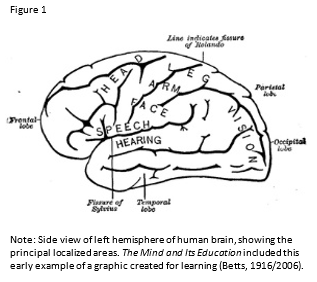
Betts, G. H. (2006, December 29). The mind and its education [ebook no. 20220]. D. Appleton and Company.
https://www.gutenberg.org/files/20220/20220-h/20220-h.htm (Original work published 1916)
Educause. (2015, March 9). 7 things you should know about visual literacy [Brief].
https://library.educause.edu/~/media/files/library/2015/3/eli7118-pdf.pdf
Haas, A. (2015). 3.2 Visual elements—Basic things that can be seen. In, Graphic design and print production fundamentals. BCcampus.
https://opentextbc.ca/graphicdesign/chapter/3-2-visual-elements-basic-things-that-can-be-seen/
Hart, J. (2018). Graphics & infographics tools. Centre for Learning & Performance Technologies.
http://c4lpt.co.uk/directory-of-learning-performance-tools/graphics-and-infographic-tools/
Lohr, L. (2008). Creating graphics for learning and performance: Lessons in visual literacy (2nd ed.). Pearson Education.
Mayer, R. E. (2014). Multimedia instruction. In J. M. Spector, M. D. Merrill, J. Elen, & M. J. Bishop (Eds.), Handbook of research on educational communications and technology (4th ed., pp. 385-399). Springer Science & Business Media.
https://doi.org/10.1007/978-1-4614-3185-5
